
Simplified and merged referral pages for better usability
#UX #UI #WebRedesign #Web
Project Timeline
Dec 2023 - Feb 2024
My role & Team
UX/UI Designer
-
Marketing Team, Project Manager, FE Engineer, QA Engineer
Platform
Web
Approach
Competitive Analysis, Target Audience, Wireframe, Mockup, Component Design, Cross-Breakpoint Responsive Design
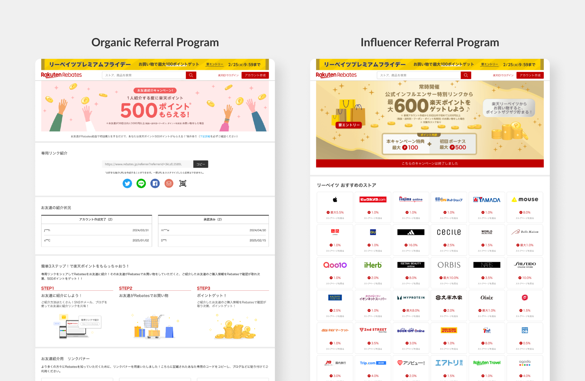
Rakuten Rebates is a point-back service available in Japan, where users can earn points by referring friends, and their friends can also earn points. This is called the organic referral program. Additionally, we have a separate referral program for influencers.
Due to changes in Japanese law, we need to combine the organic referral page and the influencer referral page into a single page. This merger introduces a more complex point system, which could be challenging for users to understand. We need to create a unified design that caters to both organic referrers and influencers without overwhelming the user experience. Furthermore, due to budget constraints, the referral system is relatively complex. Given resource and time limitations, we should reuse existing components rather than developing new ones unless absolutely necessary.
The goal of this project is to design a page that serves two user groups, improve the information hierarchy, simplify the user experience and clarify the multi-stage point system.
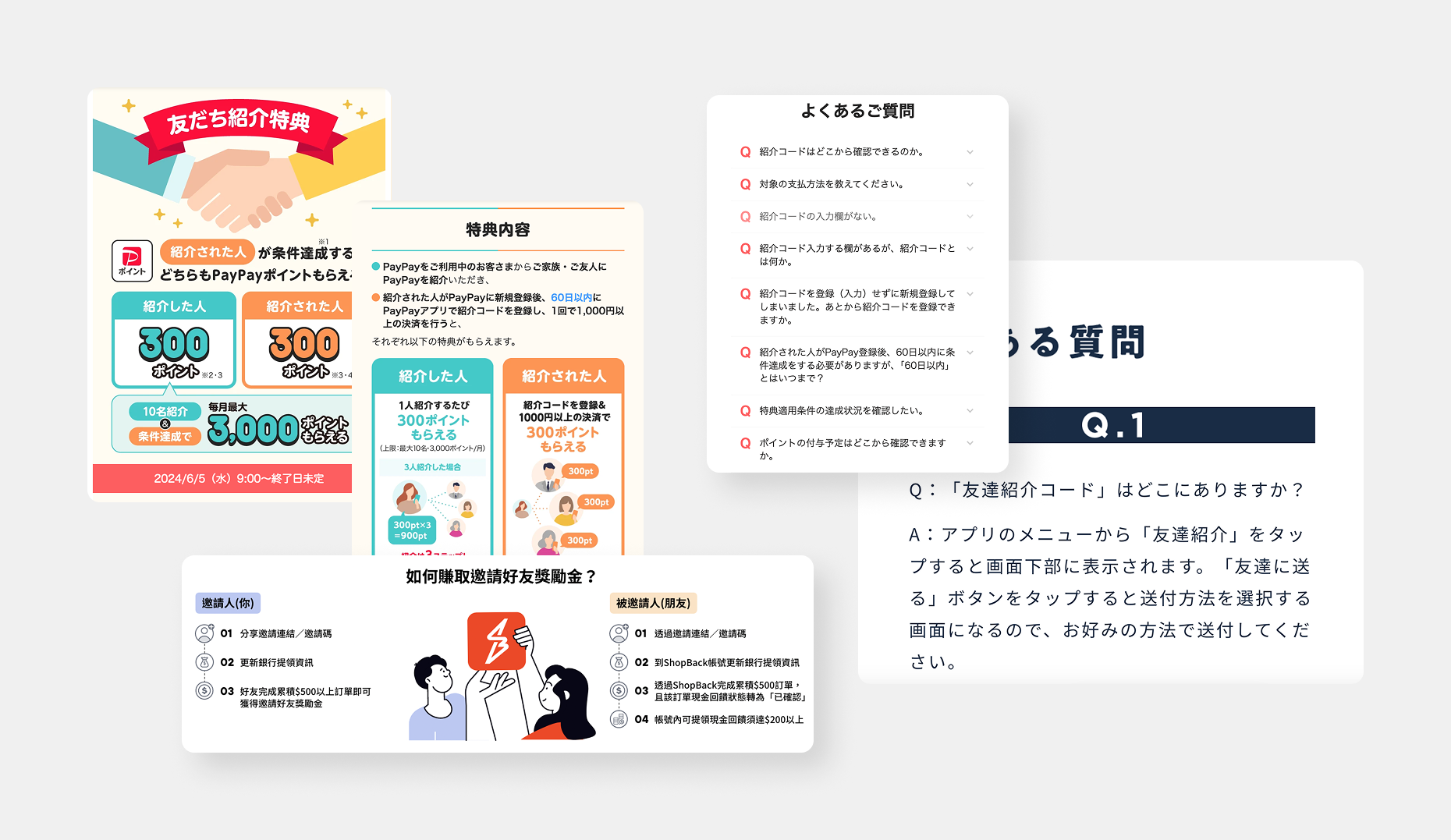
Through analysing competitor referral pages, I observed that many of them break down the referral process into clear, step-by-step explanations of how referrers and referees can earn points. I recommended updating our hero and secondary banners to improve user understanding. Additionally, many pages include a Q&A section to address common user questions, which I also considered for our page. To gather insights on user needs, I conducted internal interviews to determine which parts of the referral page are most important, helping guide the information architecture and hierarchy.
The referral page must serve two groups: organic referrers and influencers. Our aim is to value organic referrers while also catering to influencers. The page flow starts by introducing the basic referral process (for organic referrers) and progresses to the point stages (for influencers).
After discussions with the marketing team, they agreed with the flow of introducing the general referral process first, followed by the point stages. We also discussed how to best present the stages to avoid confusion. Marketing supported the idea of revamping the banners and updating the overall look and feel of the page, so I communicated these changes to the creative design team. Additionally, I spoke with the PM, who informed me that due to limited development resources, it would be preferable to reuse existing components and only consider creating new ones if absolutely necessary.
Due to legal requirements, we must combine the organic and influencer referral pages into one, which may result in information overload for both user groups. The challenge is to present relevant content to each group without overwhelming them.
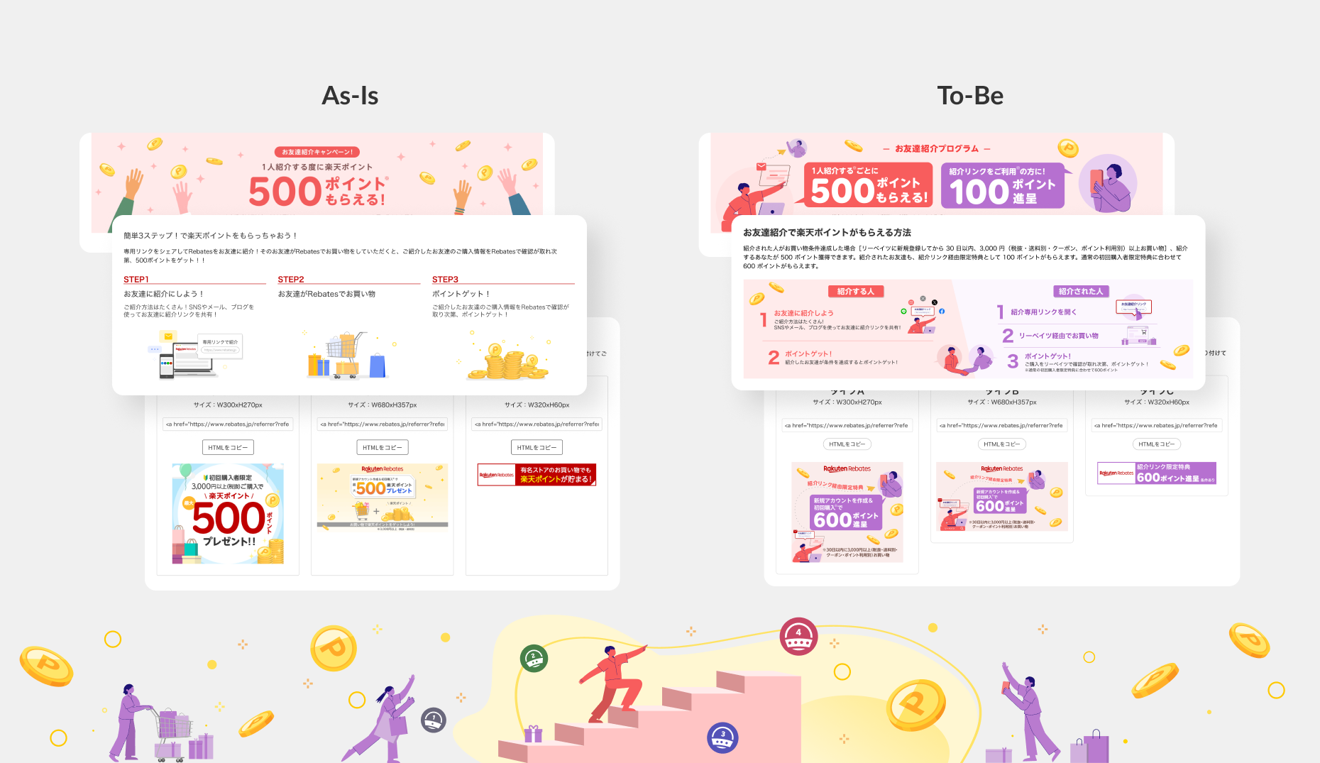
I began by creating wireframes and defining the information architecture, which I used as a foundation to discuss layout and user flow with the marketing and PM teams. Given the length of the page, I suggested incorporating anchor links to facilitate easier navigation. Additionally, I proposed the use of reusable components, such as stage cards and a Q&A section, even though the PM mentioned limited resources. The main advantage of these components is their ease of updating and their ability to enhance the overall user-friendliness of the page.
The previous referral page had banners from different sources, which made the page feel disjointed. I recommended updating the content in these banners and unifying the design for a more consistent experience. I also suggested incorporating illustrations (e.g., stairs) to symbolize progress through the stages. Additionally, tiles unique to the referral page were updated to align with the new design system, providing a more cohesive look.
Although I did not conduct external user testing, I carried out five internal tests to assess whether users could understand the point stages. This provided valuable feedback on how the new design resonated with users. Based on user feedback, I made adjustments to improve the clarity of the infographic and stage cards. The iterative process helped fine-tune the design to ensure the information was easily digestible.
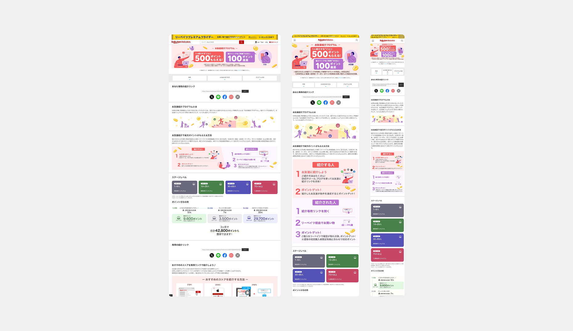
I created responsive page layouts for three different breakpoints, ensuring the design worked across various devices. For new components, I provided detailed specifications to ensure the development team adhered to typography guidelines for different screen sizes. I also conducted design review to ensure the page functioned as intended.
One of the primary challenges was designing for two distinct user groups (organic referrers and influencers) while keeping the content clear and concise. Additionally, simplifying the multi-stage point system to make it easy for users to understand was another challenge. Through this project, I learned the importance of continuous collaboration with stakeholders and iterative design to refine the user experience.
While internal testing provided valuable insights, I recommend conducting external user testing with a wider audience, particularly with both organic referrers and influencers, to validate the design further.