
Created atomic components across platforms
#DesignSystem #Web #iOS #Android
Project Timeline
Apr 2023 - Sep 2023
My role & Team
UX/UI Designer
-
Project Manager, FE Engineer, QA Engineer
Platform
Web, iOS, Android
Approach
Design System Evaluation, Guideline Research, Component Design, Platform-Specific Design, Design Audit
Rakuten Rebates is a point-back service available in Japan, providing services on Web, iOS and Android platforms. Before I joined the team, there was a partially developed design system in place. However, it lacked maturity, with significant inconsistencies between the actual product and the Figma files. Additionally, accessibility issues had not been fully addressed. As a result, the system lacked stability, leading to poor user experiences, development difficulties, and maintenance issues that significantly decreased overall efficiency.
As a team of two UX designers, our goal was to update and complete the design system to enhance consistency, usability and efficiency in both design and development. We also focused on addressing the differences between Web, iOS and Android platforms while implementing responsive web design (RWD). To achieve this, we followed established guidelines such as Material Design, iOS Human Interface Guidelines and our in-house Rakuten design guidelines.
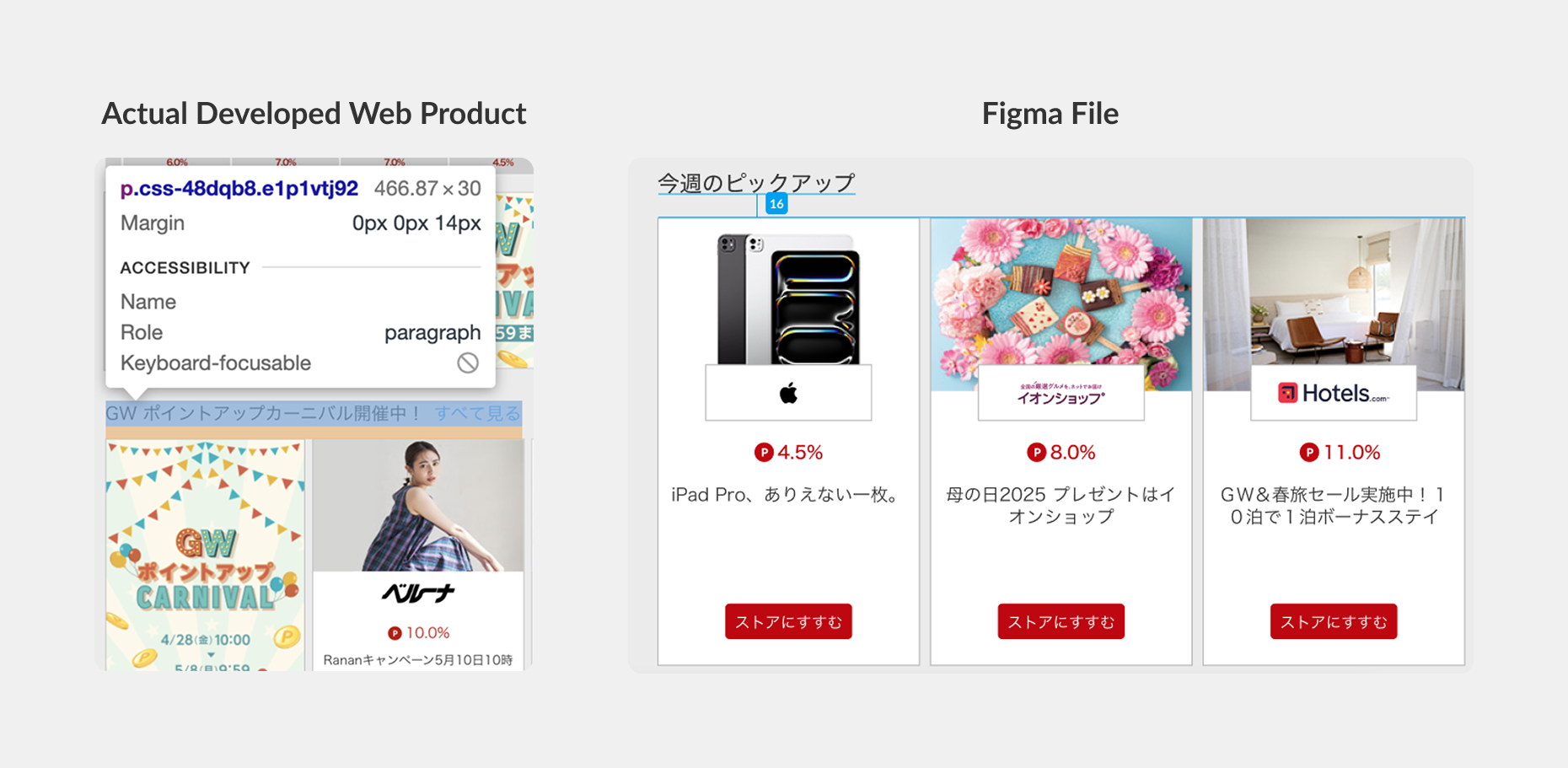
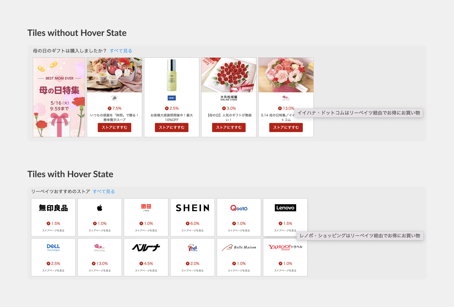
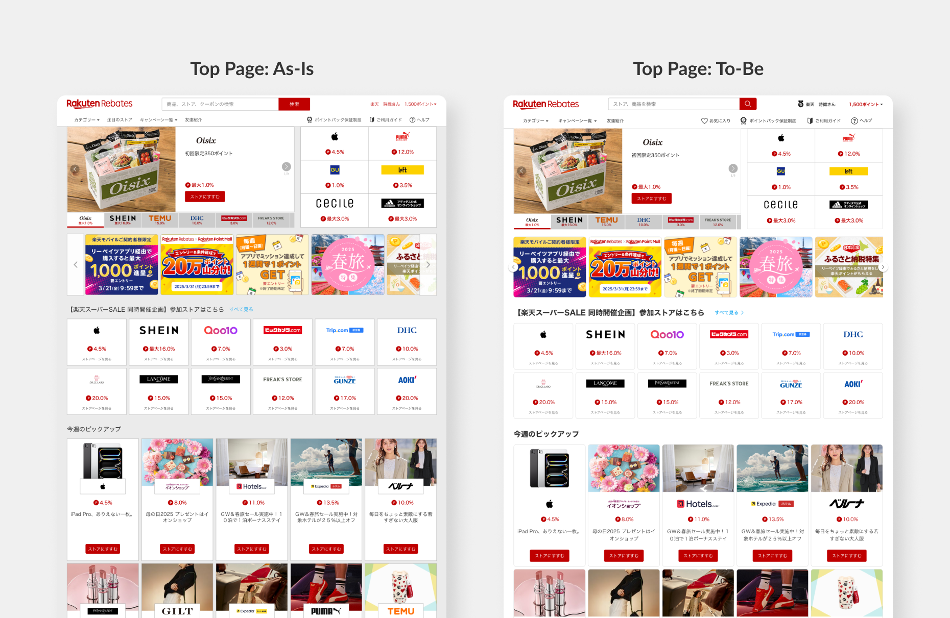
The Rakuten Rebates design system was immature and inconsistent, which negatively impacted the user experience. Its instability led to development errors and higher costs. There was also a considerable gap between the actual developed Web product and the Figma files. Some inconsistencies included tiles with hover states while others did not, leading to further confusion. A key challenge was how to persuade other teams, such as Product Management (PM) and Development, to update the design system, as this would require significant effort to upload new components into the product.
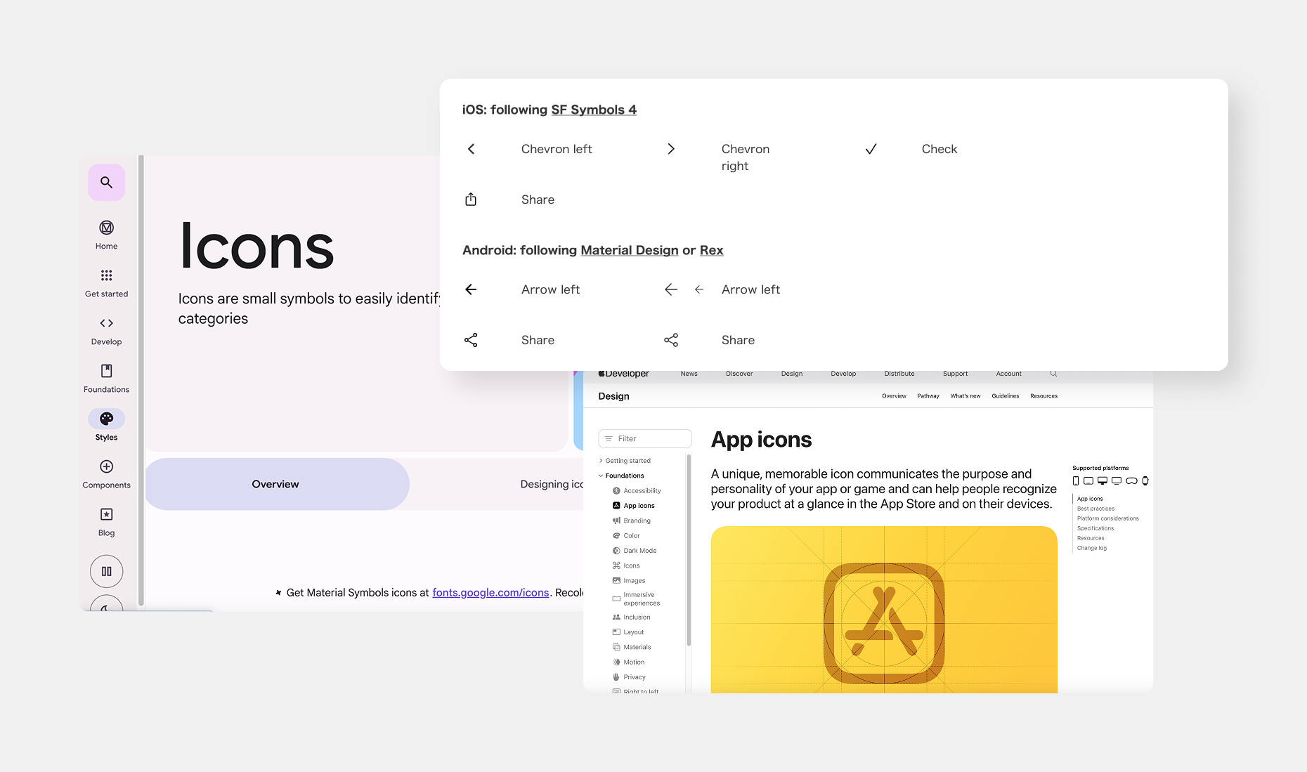
We began by evaluating the existing design system and reviewing various design guidelines, such as Material Design, iOS Guidelines and our internal Rakuten guidelines. The goal was to identify common practices and prioritise accessibility and usability. Additionally, we communicated with the PM and development teams to gather feedback on pain points and improvement areas.
Next, we focused on structuring the design system. We adopted Atomic Design principles, starting with atoms (Foundations), progressing to molecules (Components), then organisms (Sections), and finally Templates and Pages. This hierarchical approach helped us create a more organised and scalable system.

After establishing the skeleton of the design system, we created components atom by atom, updating the UI to align with current trends. To account for platform-specific differences in font usage, colour schemes, and other design elements, we structured the design system into distinct versions for Web, iOS and Android. This approach helped minimise the risk of outlier components and made the system easier to maintain.
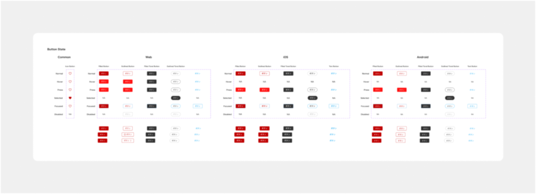
For all components, we ensured consistency, accessibility and cross-platform compatibility.
Once the design system was complete, we began updating the new components in our mockups. We created Master files and templates for critical pages, such as the homepage, to ensure consistency. Important specs were mocked up in our Design System file and Master files to reduce discrepancies between the Figma designs and the actual developed product.
We maintained close communication with the PM and development teams to ensure they understood the design logic (e.g., tappable areas) and collaborated on prioritising updates. We began with areas that were less impactful and easier to update, and divided the work into Jira tickets. As the development team worked on each ticket, the QA team sent it back to me for a design audit. After the design audit, I sent it back to the developers. Through this back-and-forth process, we ensured the quality of the design, made sure everything was up-to-date and minimized discrepancies between our design system and the actual products to improve user experiences and brand alignment.
The updated design system significantly improved accessibility and usability for users while increasing efficiency for both designers (easier to design and maintain) and developers (easier to follow with fewer mistakes). Cross-platform design consistency also improved, creating a more unified experience across Web, iOS, and Android. Although it was initially challenging to persuade other teams of the value of the design system, and the back-and-forth of design audits was time-consuming, in the end, everyone understood its value, and the effort was worth it.
We will continue to maintain and improve the system, keeping up with design trends and iterating based on user feedback through user testing. The goal is to ensure the system remains adaptable and efficient as the product evolves.