
Turned scattered requirements into guided steps
#UX #UI #UXResearch #App
Project Timeline
Sep 2025 - Dec 2025
My role & Team
UX Researcher & Designer
-
Team of 5
Platform
iOS Mobile
Approach
Literature Review,Competitor Analysis, UserInter views, AffinityMapping, Personas,Journey Map,Stor yboarding, Crazy 8s.Task Flows, Wireframing,Prototyping, UsabilityTesting, Iteration, UIDesign
People flying to Canada with their dogs have to piece together information from airline websites, government pages, and online forums, and the information often conflicts. Less than 40% of dog owners understand Canada's pet import requirements (Ekos Research Associates, 2023), and the pet travel market is growing 8% annually (ICT Monitor Worldwide, 2025).
Based on our competitor research, we could not find a single product that brings airline rules, government requirements, and vaccination timelines together in one place.
How might we help first-time dog-traveling owners feel confident they have prepared correctly, without juggling different websites?

Create a simple and trustworthy mobile tool that helps first-time dog travelers understand what they need to prepare and feel more confident throughout the process.
This was a 12-week academic project scoped to research and mid-fidelity prototyping. It was not shipped, and the iterated design was not re-tested after the final round of changes.
I contributed 2 literature reviews as part of the team's broader research effort, which included 6 literature reviews and 4 competitor analyses in total. I also conducted 2 of the 10 user interviews and worked with the full set of transcripts during synthesis.
I did my own research, and also I compared different sources.
We actually got really curious about what the dog is doing at the airplane... Is he doing well? So, we were a little bit concerned about his health condition.
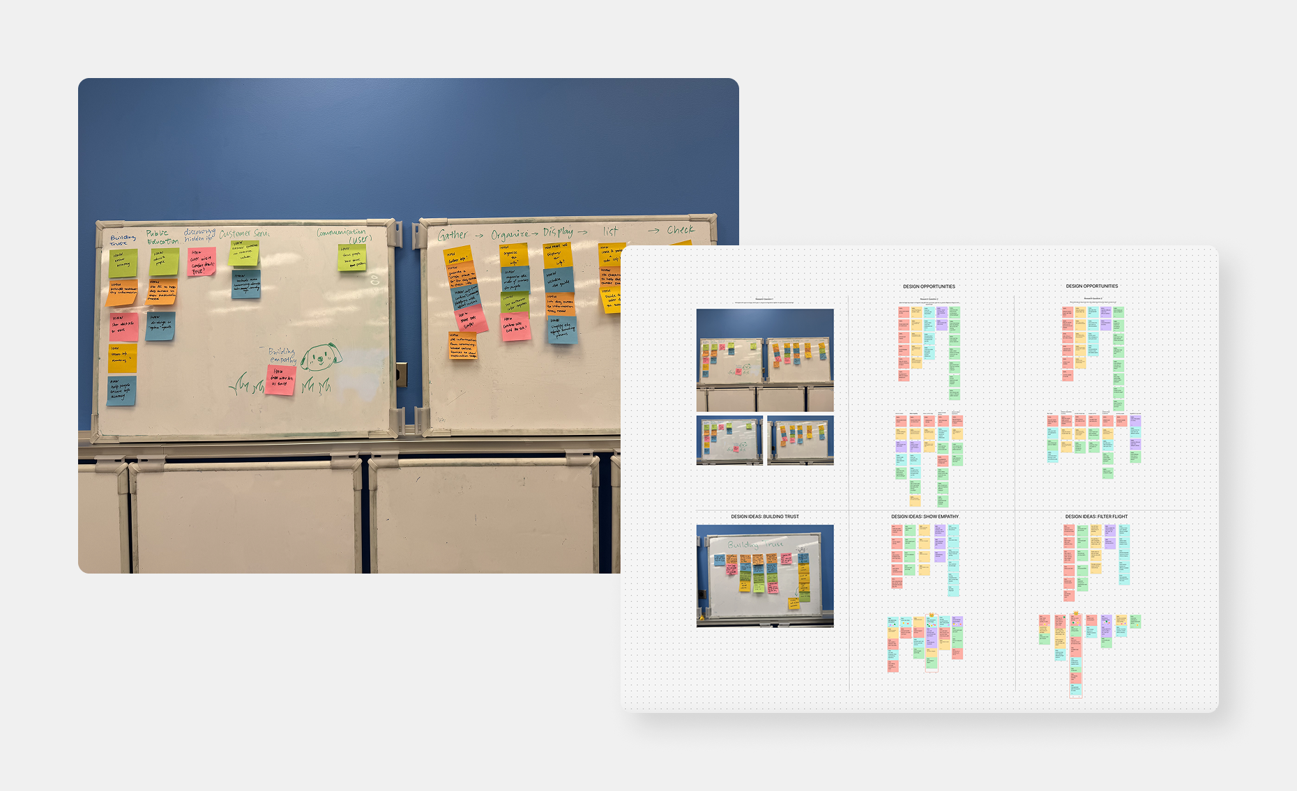
I helped map all interview notes into an affinity diagram to find patterns. We then built a user journey map that showed where stress peaked and defined our main persona: "Peng the Planner," a tech-savvy, thorough dog owner who researches extensively but still feels anxious about making a mistake that could affect her dog.
The journey map showed stress peaking in the weeks before departure, when the number of tasks felt most overwhelming.Three core user needs emerged from this work: clarity, trust, and emotional support.
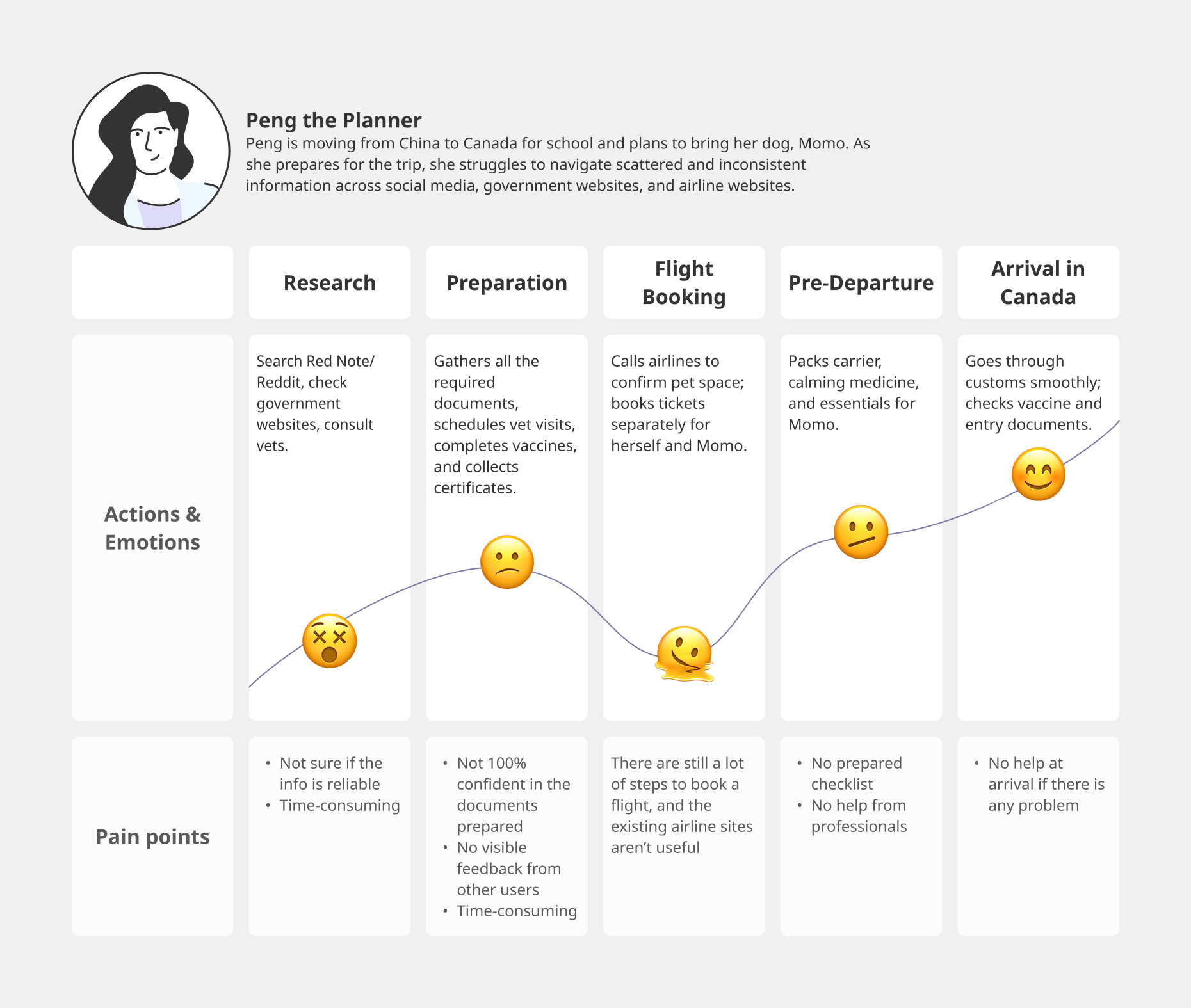
These three needs guided our design decisions in the next stage.
Users need requirements presented in one place, in plain language, with a clear sequence
Users need to know information comes from official sources and is current
Users are anxious about getting it wrong. Tone and language matter as much as content
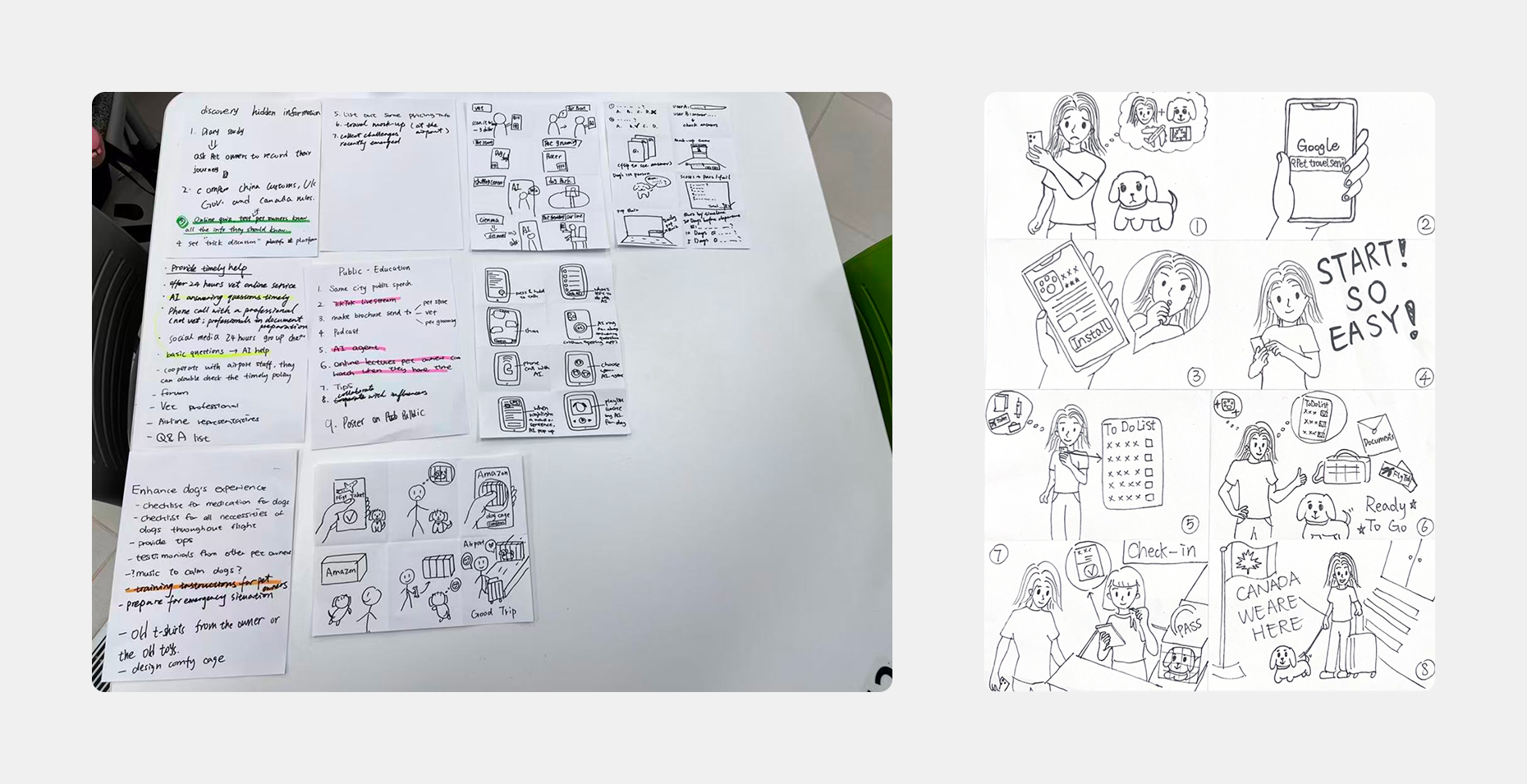
Based on the three core needs, we used Crazy 8s, storyboards, task flow mapping, and a "golden path" to explore different ways to simplify the process and reduce the need to search across multiple websites.
We landed on a guided mobile tool that asks users targeted questions about their trip, then generates a personalized, timeline-based to-do list linked to official sources. The to-do list structure emerged because users needed sequencing: knowing when to do things was as important as knowing what to do.
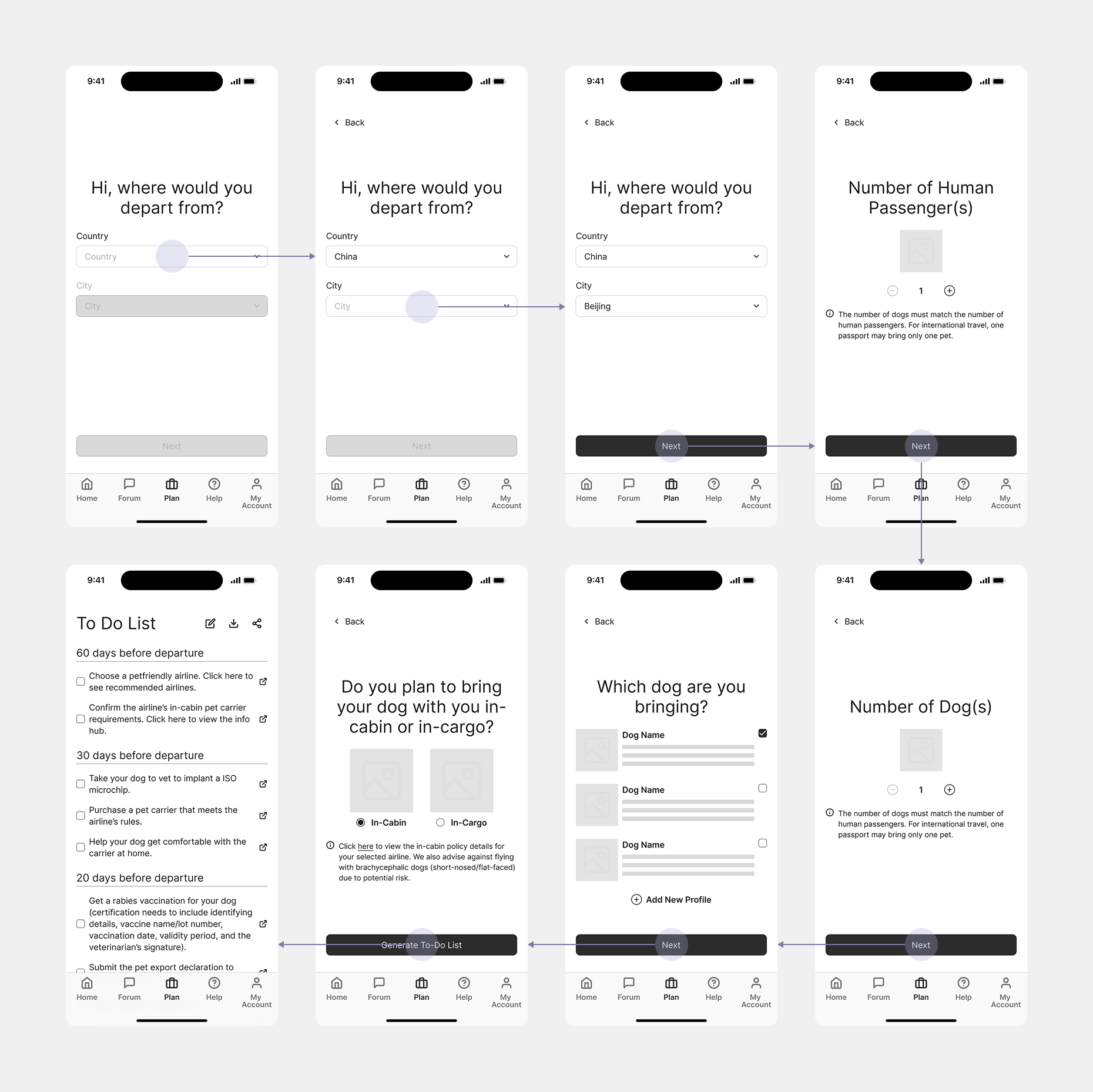
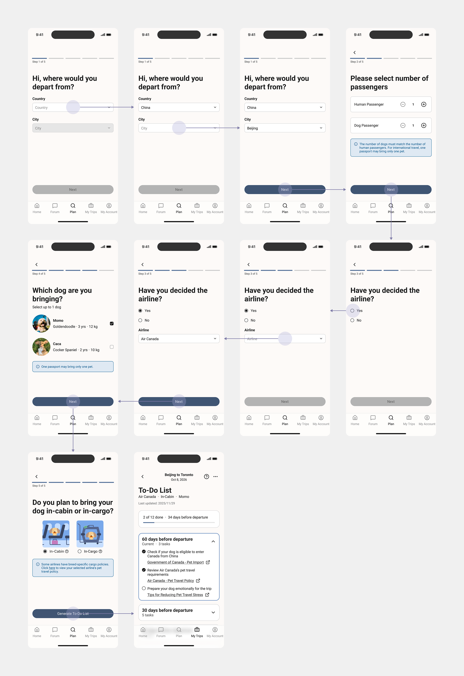
We built a mid-fidelity iOS prototype covering the core flow: selecting departure country and city, entering passenger count, building a dog profile, choosing in-cabin or cargo, and generating a personalized to-do list organized by time before departure.
I facilitated 2 of our 10 moderated usability sessions and took notes in 6 total. After each round, I helped the team identify patterns and prioritize fixes.
Hard to read on the to-do list page, so many text.
How to confirm the info is official and up to date?
Based on the usability testing findings, I made targeted improvements to the design. I also made a few additional refinements to improve the overall flow and clarity.
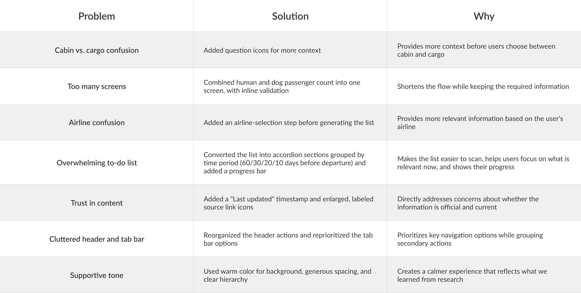
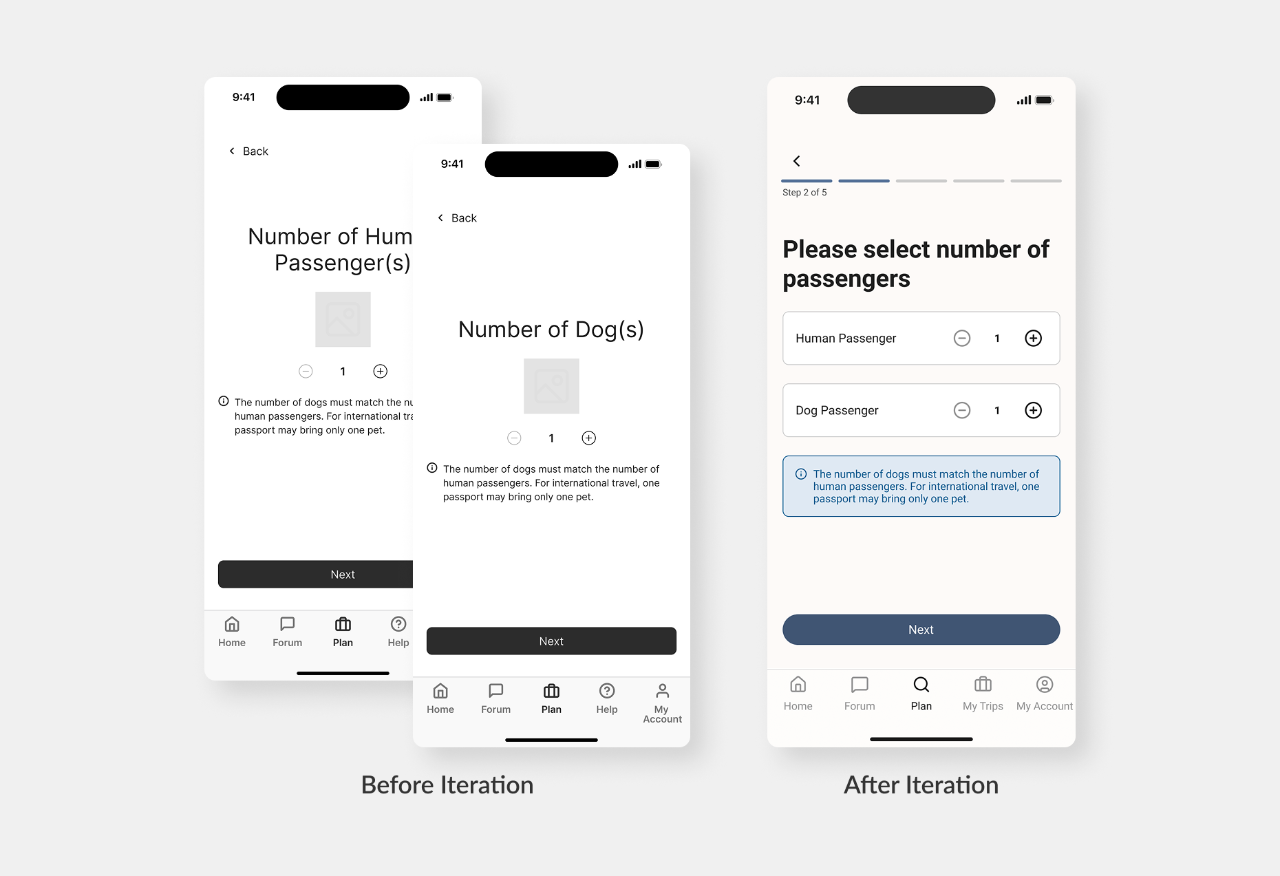
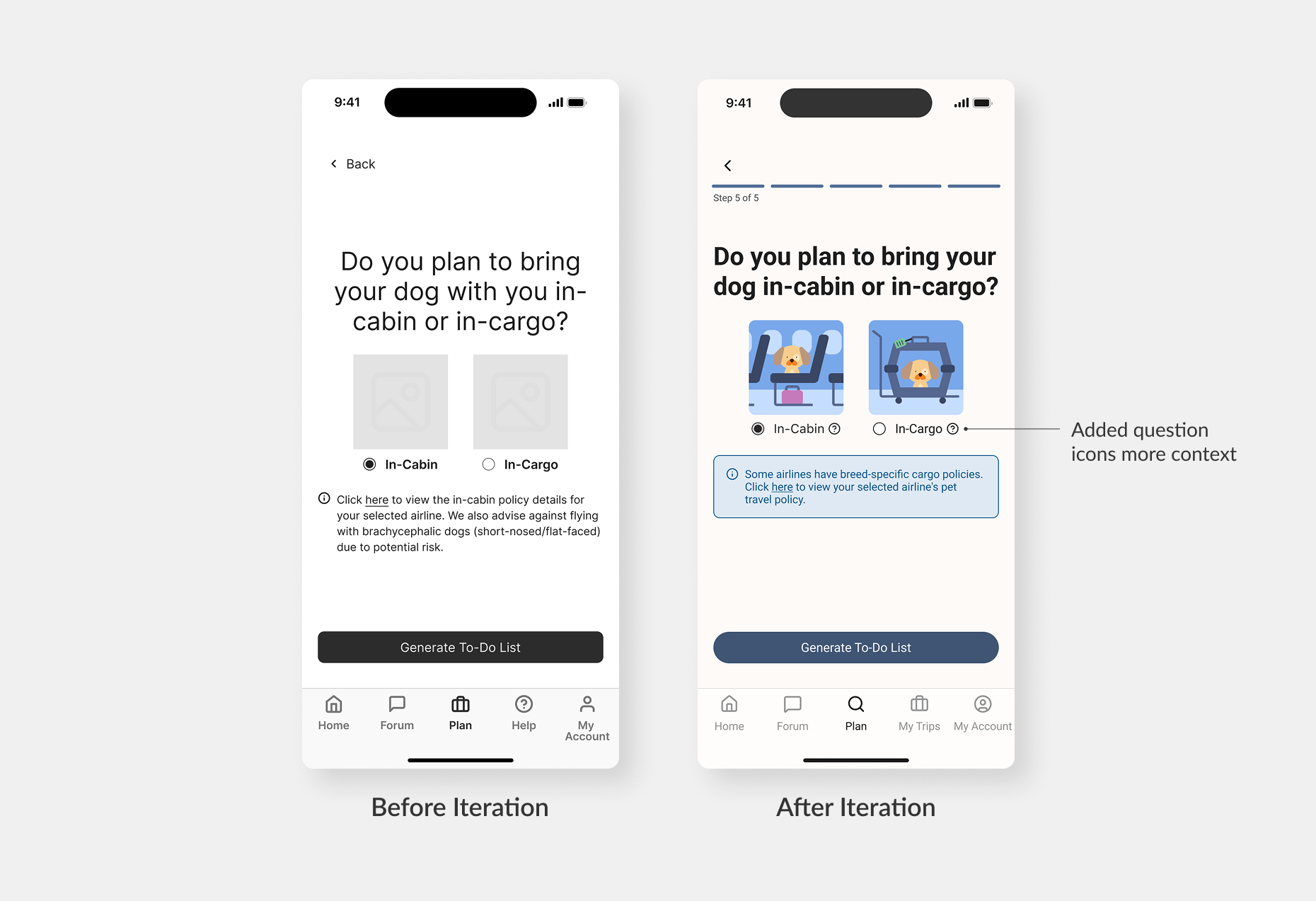
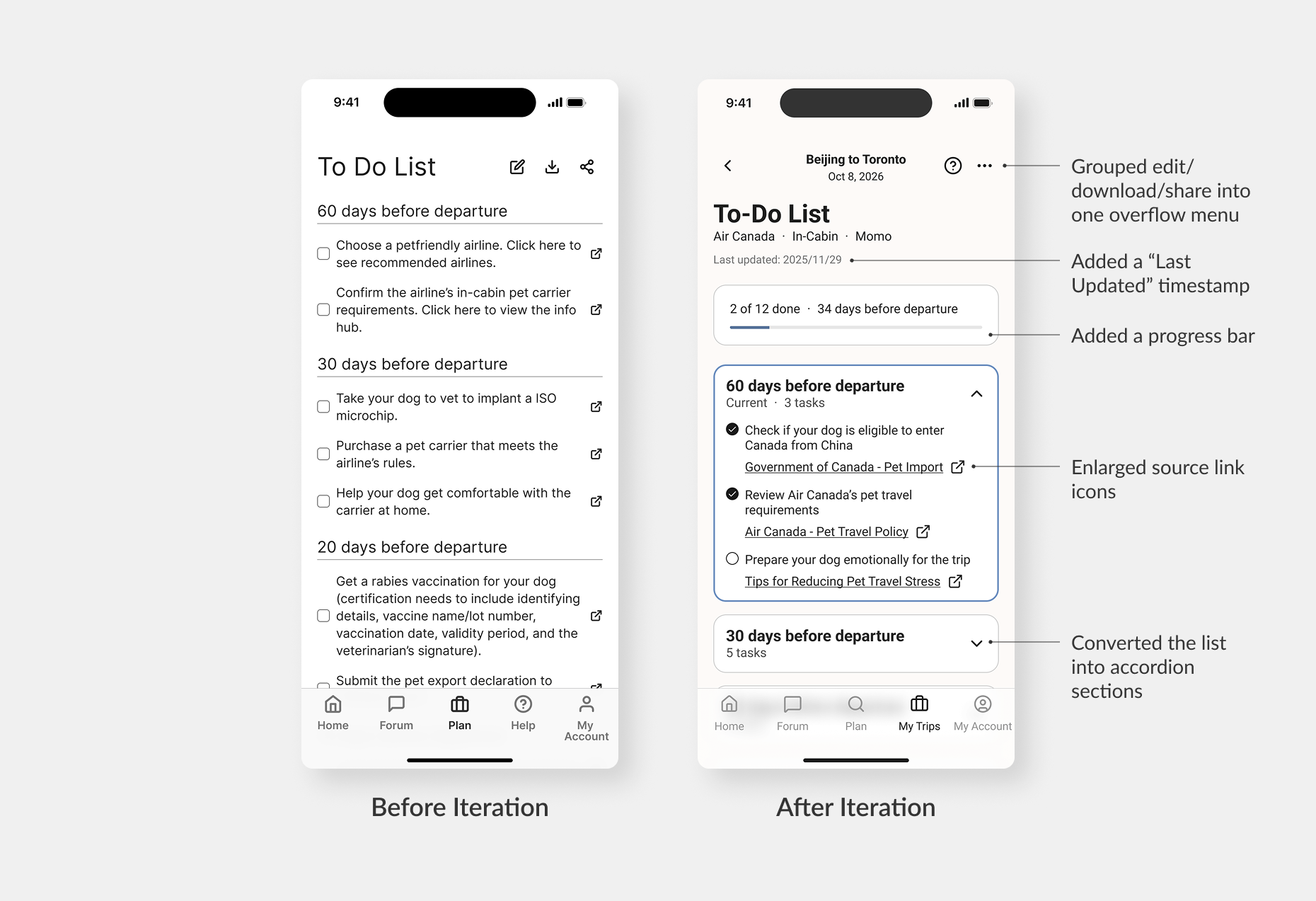
The final flow moves users through six screens:
The to-do list is organized by time before departure (60, 30, 20, 10 days), uses accordion sections to make a long list easier to navigate, shows labeled links to official sources such as Government of Canada and airline policy pages, and displays a "Last updated" timestamp at the bottom.
The visual design uses a warm cream and blue palette with clear typographic hierarchy, designed to feel calm and trustworthy rather than urgent or clinical.
User Research. Contributed 2 literature reviews and conducted 2 of the 10 user interviews. Worked with the full set of interview transcripts during synthesis and helped identify the repeated user needs that became the 3 core insights guiding the first round of design decisions.
Prototyping Support. Co-created digital wireframes with Auto Layout, consistent spacing, and reusable components. Guided a teammate who was new to Figma through frames and components so everyone could contribute more independently.
Usability Testing. Facilitated 2 of 10 sessions and took notes in 6 total. Worked with the team to group patterns afterward and refine 3 main insights that shaped the next iteration.
Team Alignment. When the team debated design directions, I brought discussions back to specific research findings to keep decisions evidence-based and move faster.
Final Deliverables. Standardized typography, spacing, and hierarchy across slides and report. Designed the style tiles and completed revised UI screens for my individual prototype.
Small UI changes can make a big difference. One thing I learned from this project is that improving an experience doesn't always mean adding more features. For example, changing the long to-do list into accordion sections was simply a different way of organizing the same information, but it directly addressed one of the main issues we found during testing. Better design isn't always more design.
Connecting research to design decisions. I became more aware of how important it is to connect design decisions back to research. The strongest decisions in this project were the ones we could clearly trace back to a user quote or repeated pattern. I also became more comfortable turning messy research notes into clear insights that the team could design around.
What I would do differently. I'd add a second round of usability testing on the iterated design to validate whether the changes actually reduced confusion and stress, practice facilitating more sessions myself, and find better ways to bring quieter teammates into ideation earlier. I'd also explore whether a progress indicator during onboarding would help users feel oriented in the flow.


